Overview
Fallmart is a comedic single player simulation game where you play as a convenience store worker who manages unruly customers in the middle of a pandemic. The player's job is to slap facemasks on customers, spray disinfectant on infected areas, throw toilet paper on the crowd of customers that are fighting over toilet paper and throw customers who are being disruptive in different ways out of the store.
Project Details
Roles: Product Owner and Game Designer
Team size: 9 people
Production time: 7 weeks
Release date: September 2021
Genre: Simulation
Game Engine: Unreal Engine 4
Supported Platform: PC
What I did for the project
Product ownership
Creating user stories
Presentations
Manage backlogs
Game Design
UX Design
Level Design
Core loop
Core Design Pillars
Quick decision making
Readability
Comedy
The UI
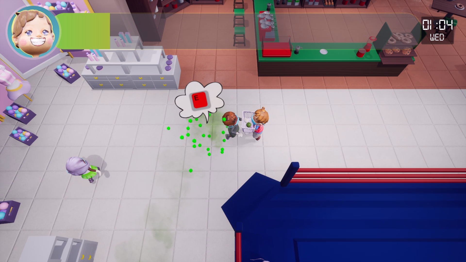
The thought process behind the UI for the game was always to have Readability and Comedy in mind. With this in mind, I began with sketching a rough idea of the UI. With the readability in mind I decided to make the infection meter of the store fairly large due to the importance of it. The clock was also very big due to the player needing to see how much time there was left in the day. Then there is the portrait of the player character, this was added to add comedy to the UI being a reference to the early Doom games. The player character’s mood would change depending on the current level of infection. They would go from Happy to Annoyed to Angry and finally Infected.
The second revision of the UI was by making it a bit smaller. I still wanted to make the infection meter big, but not too big and block too much of the screen. The clock would also be changed from analogue clock to a digital clock, this was because it’s much easier to make it readable when it comes to digital compared to analogue. I also wanted the clock to be similarly designed to that of a digital watch, so I wanted to also add the day the player is currently on under the timer.
The third and final revision I finalized the idea of the infection bar, player portrait and the clock. The previous idea of making the UI symmetrical was changed because I wanted to make it instead look like a thermometer which would fit the theme of infection and being sick. The infection bar also slowly fills up and starts from green and slowly goes to red the more it fills.
The Level Design
The level was inspired by real life stores where customers can move around the shopping mall in a circle while also taking a shortcut in the middle.
The arena is also in the middle of the store, to make it so that it is easy for the player to access the important area as fast as possible.
Takeaways from being a Product Owner
How to organize scrum meetings in a productive way to make sure everyone is on the same page
The importance of having everyone enthusiastic and excited about the project and the final product
Being aware of our resources and budget and making the most of it


